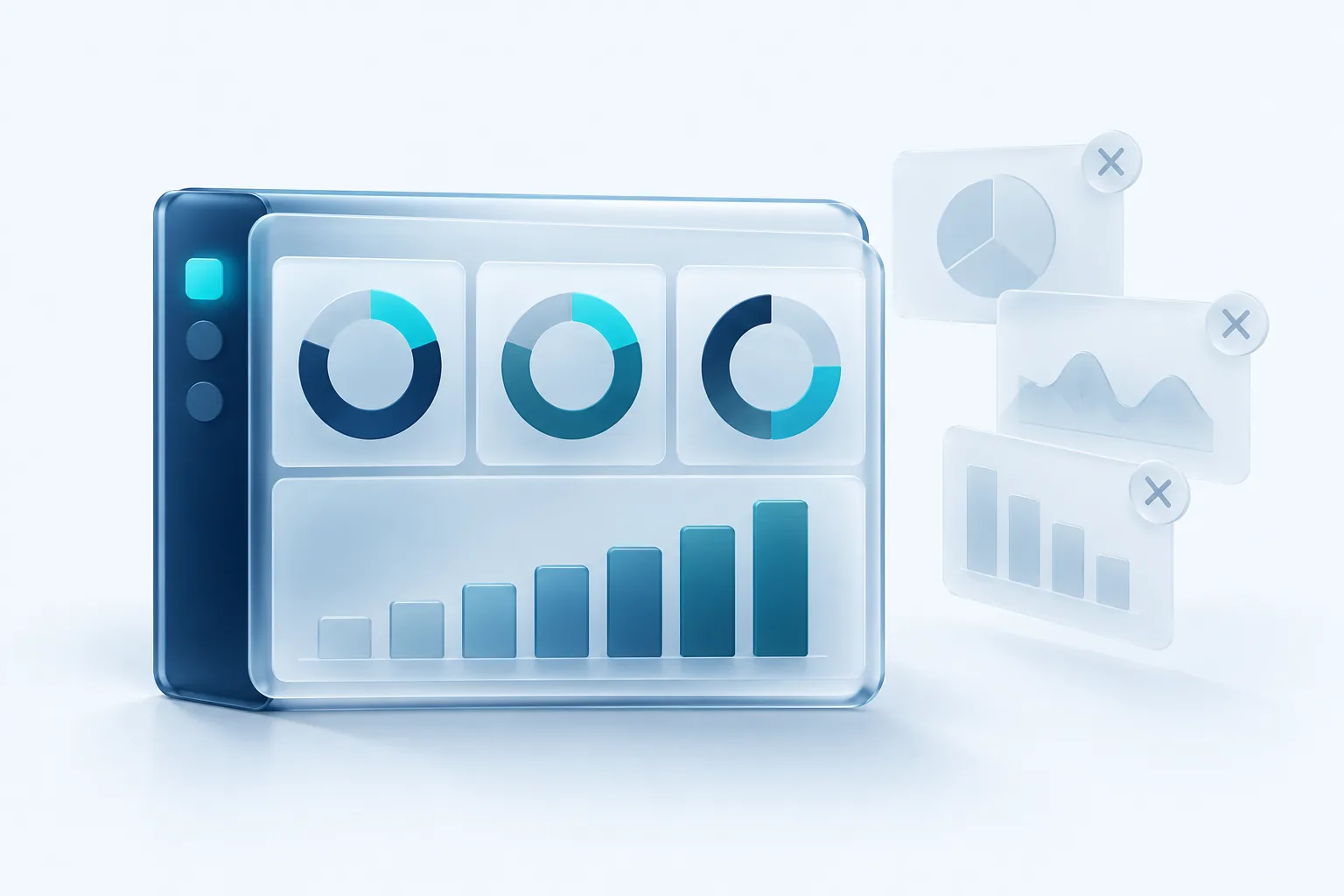
A good internal dashboard answers the questions your team asks every morning before anyone has to ask them. A bad one is a wall of charts that nobody opens after the first week.
The difference has little to do with the software. It comes down to choosing the right numbers, presenting them clearly and making sure people trust the data. Here is how to get those three things right.
Start with decisions, not data
The most common mistake is starting with whatever data is easy to pull. Instead, start with the decisions people make. For each role, ask what they decide each day or week and what they need to know to decide well.
- An operations manager might decide how to staff tomorrow, so they need booked jobs, open capacity and overdue work.
- A sales lead might decide where to spend the week, so they need pipeline by stage and deals that have gone quiet.
- An owner might decide whether to hire or cut spending, so they need revenue trend, cash position and margin.
If a number does not change anyone's behaviour, it probably does not belong on the main screen. That one rule removes most of the clutter.
Avoid vanity numbers
Vanity metrics are numbers that look impressive but do not tell you whether the business is healthier. Total website visits, all-time customer count and social followers tend to go up regardless of performance, so they feel good without informing much.
Better metrics are tied to outcomes and can go down as well as up. Some useful swaps:
- Instead of total visits, show enquiries or bookings from the website this week.
- Instead of all-time customers, show active customers and how many returned this quarter.
- Instead of revenue alone, show revenue alongside gross margin.
- Instead of tasks completed, show work that is overdue or at risk.
The five-number test
If you could keep only five numbers on the screen, which would they be? Put those at the top, large and clear. Everything else goes below or onto a detail page. If your team cannot agree on the five, that conversation is more valuable than any chart.
Layout that reads at a glance
People scan a dashboard the way they scan a newspaper: top left first, then across and down. Use that to your advantage.
- Put the most important numbers at the top as simple figures with a comparison, such as this week versus last week.
- Use colour sparingly, mainly to flag something that needs attention. If everything is red or green, nothing stands out.
- Prefer simple line and bar charts. Pie charts and gauges look appealing but are harder to read accurately.
- Label everything in plain language, including the time period and the units.
- Keep detail one click away rather than crowding the main view.
Design for where people will look at it. A screen on the shop floor needs large text and very few numbers. A manager's laptop view can hold more detail. A phone view should show the top few figures only.
Data sources and a single source of truth
Most small businesses have data spread across accounting software, a CRM, an e-commerce platform, spreadsheets and perhaps a job management tool. A dashboard pulls these together, which is where most of the actual work lies.
Before building, decide which system is the source of truth for each number. If revenue appears in both your accounting tool and your online store, pick one and say so on the dashboard. Otherwise people will find two different figures and stop trusting both.
Where possible, connect to systems through their official APIs rather than manual exports. Spreadsheets that someone updates by hand are fine for a prototype, but they tend to go stale and quietly break.
Refresh rates and keeping trust
Not everything needs to be live. Real-time updates add cost and complexity, and most business decisions do not need them. Match the refresh rate to how often the decision is made: live or every few minutes for a dispatch board, hourly or daily for sales and operations, and daily or weekly for financial trends.
Always show when the data was last updated. If a data feed fails, the dashboard should say so clearly rather than show old numbers as if they were current. A dashboard that is wrong once without warning can lose people's trust for months.
Our recommendation
Start with one audience and one screen. Interview the people who will use it, agree on five numbers that drive real decisions, and build a simple version from the data you already have. Use it for a month, remove anything nobody looks at, and add only what people ask for. A small dashboard that everyone trusts is worth far more than a large one that everyone ignores.

Written by Vishal Singh
Founder of Byte Harbor and a senior frontend and web platform engineer. He builds websites, custom software and AI automation for businesses across Canada and the US.
About Byte HarborRelated service
Custom software and web applications built around your workflow
A portal, dashboard or scheduling tool shaped around your workflow, so routine work takes less effort.
Explore Custom Software & Web Applications